
As part of the EU Horizon 2020 MOOD project (MOnitoring Outbreaks for Disease surveillance in a data science context), mundialis was invited to speak at the MOOD Science Webinar in February.
The MOOD project aims to develop innovative tools and services for the early detection, assessment, and monitoring of current and future infectious disease threats across Europe in the context of continuous global, environmental, and climatic change.
Against this background, MOOD hosts a monthly series of Science Webinars where (research) work on disease surveillance and modelling in data science, the impact of global warming on disease outbreaks, and the building of one-health systems across Europe and the world is discussed.
In the webinar, mundialis presented a newly developed application showing graphs for COVID-19 “status” in Germany. The graphs are based on the official COVID-19 statistics of the Robert Koch Institute. They use data on 7-day incidences and the change in new cases in different regions in Germany and compare them graphically.
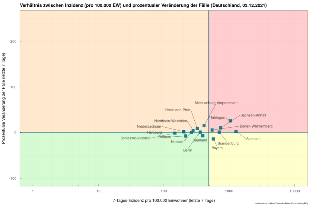
The graph (above) shows the position of the German federal states in relation to the national averages. The horizontal axis shows the 7-day incidence per 100,000 inhabitants and the vertical axis shows the percentage change of weekly new cases over the last week. The intersection of the quadrants shows the average values at the national level.
The plots are available for Germany and for the individual federal states of Germany with the respective counties. They are updated daily so that changes over time become visible. All plots and a detailed explanation can be found at https://apps.mundialis.de/mood/covid19plots/.
In the webinar both the background and the development of the scatterplots as well as the interpretation, challenges and an outlook were presented. The recorded presentation of the webinar, including also an interview, is available on the TIB AV portal. It gives a good overview of the graphs and the respective application.
If you have any questions, please do not hesitate to contact us![:de]Im Rahmen des EU Horizon 2020 MOOD-Projektes (MOnitoring Outbreaks for Disease surveillance in a data science context) war mundialis im Februar als Referent zum MOOD Science Webinar eingeladen.
Ziel des MOOD-Projektes ist die Entwicklung innovativer Instrumente und Dienste für die frühzeitige Erkennung, Bewertung und Überwachung aktueller und künftiger Bedrohungen durch Infektionskrankheiten in ganz Europa vor dem Hintergrund eines kontinuierlichen globalen, ökologischen und klimatischen Wandels.
In diesem Kontext wird in der monatlich stattfindenden Reihe der Science Webinare über (Forschungs-)Arbeit zur Krankheitsüberwachung und Modellierung in der Datenwissenschaft, die Auswirkungen der globalen Erwärmung auf Krankheitsausbrüche und den Aufbau von One-Health-Systemen in Europa und der Welt berichtet.
mundialis stellte im Webinar eine neu entwickelte Anwendung des Hauses vor, die Graphen für den COVID-19 -“Status” in Deutschland zeigt. Die Graphen beruhen auf den offiziellen Corona-Statistiken des Robert Koch-Instituts. Es werden 7-Tages-Inzidenzen und die Veränderung der Neuerkrankungen in verschiedenen Regionen in Deutschland herangezogen und graphisch verglichen.
Das Diagramm (oben) zeigt die Position der Bundesländer im Verhältnis zu den nationalen Durchschnittswerten. Auf der horizontalen Achse ist die 7-Tages-Inzidenz pro 100.000 Einwohner und auf der vertikalen Achse die prozentuale Veränderung neuer Fälle in der letzten Woche abgebildet. Die Kreuzung der Quadranten zeigt die Durchschnittswerte auf nationaler Ebene an.
Die Plots sind für Gesamt-Deutschland sowie für die Bundesländer Deutschlands mit den jeweiligen Landkreisen verfügbar. Sie werden täglich aktualisiert, sodass Veränderungen über die Zeit sichtbar werden. Alle Plots und eine ausführliche Erläuterung der Darstellung findet sich unter https://apps.mundialis.de/mood/covid19plots/.
Im Webinar wurden sowohl Hintergrund und Entstehung der Scatterplots als auch Interpretation, Herausforderungen und ein Ausblick vorgestellt. Die aufgezeichnete Präsentation des Webinars inklusive eines Interviews ist auf dem TIB AV-Portal verfügbar. Sie gibt eine gute Übersicht über die Graphen und die Anwendung.
Bei Fragen sprechen Sie uns gerne an!